SwiftUIのCircleコンポーネントを使ってインジケーターを作成する
tamappe Tamappe Life Log
今回はVStackに配置されているViewの位置の変更について観ていきます。
Flutterではそもそもプロパティとして用意されていた記憶があります。
こちらです。
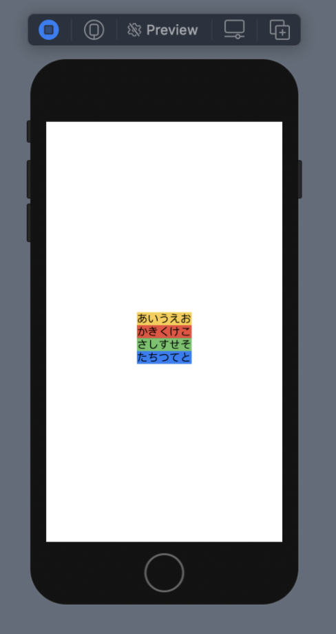
VStack はViewを縦に並べるレイアウトコンポーネントです。
基本は中央寄せになっています。
struct ContentView: View {

    var body: some View {
        VStack {
            Text("あいうえお")
                .background(Color.yellow)
            Text("かきくけこ")
                .background(Color.red)
            Text("さしすせそ")
                .background(Color.green)
            Text("たちつてと")
                .background(Color.blue)
        }
    }
}
VStackでの上下の配置を制御する場合はSpacer()を使えばいいそうです。
struct ContentView: View {

    var body: some View {
        VStack {
            Text("あいうえお")
                .background(Color.yellow)
            Text("かきくけこ")
                .background(Color.red)
            Text("さしすせそ")
                .background(Color.green)
            Text("たちつてと")
                .background(Color.blue)
            Spacer()
        }
    }
}| 下にSpacer() | 上にSpacer() |
|---|---|
 |  |
子Viewの幅がそれぞれ異なっている場合に子Viewの左右揃えについてはalignmentで制御します。
VStack(alignment: .leading) { } // 左寄せ
VStack(alignment: .trailing) { } // 右寄せ| alignment = leading) | alignment = trailing) |
|---|---|
 |  |
このalignmentの定義にジャンプするとHorizontalAlignmentだったのですね。
@available(iOS 13.0, OSX 10.15, tvOS 13.0, watchOS 6.0, *)
extension HorizontalAlignment {

    /// A guide marking the leading edge of the view.
    public static let leading: HorizontalAlignment

    /// A guide marking the horizontal center of the view.
    public static let center: HorizontalAlignment

    /// A guide marking the trailing edge of the view.
    public static let trailing: HorizontalAlignment
}
つまりVStackのAlignment は水平方向に対する揃えを制御していました。
HStack はViewを横に並べるレイアウトコンポーネントです。
同じく基本は中央寄せになっています。
struct ContentView: View {

    var body: some View {
        HStack {
            Text("あいうえお")
                .background(Color.yellow)
            Text("かきくけこ")
                .background(Color.red)
            Text("さしすせそ")
                .background(Color.green)
            Text("たちつてと")
                .background(Color.blue)

        }
        .background(Color.gray)
    }
}
HStack (背景色はグレー)
HStackのalignmentはVerticalAlignmentと言われる構造体でした。
@available(iOS 13.0, OSX 10.15, tvOS 13.0, watchOS 6.0, *)
extension VerticalAlignment {

    /// A guide marking the top edge of the view.
    public static let top: VerticalAlignment

    /// A guide marking the vertical center of the view.
    public static let center: VerticalAlignment

    /// A guide marking the bottom edge of the view.
    public static let bottom: VerticalAlignment

    /// A guide marking the topmost text baseline view.
    public static let firstTextBaseline: VerticalAlignment

    /// A guide marking the bottom-most text baseline in a view.
    public static let lastTextBaseline: VerticalAlignment
}
HStackにalignmentを使って宣言すると
struct ContentView: View {

    var body: some View {
        HStack (alignment: .top) {
            Text("あいうえお")
                .background(Color.yellow)
                .frame(height: 200)
            Text("かきくけこ")
                .background(Color.red)
            Text("さしすせそ")
                .background(Color.green)
            Text("たちつてと")
                .background(Color.blue)

        }
        .frame(maxWidth: .infinity, maxHeight: 200)
        .background(Color.gray)
    }
}
これで次のように見えます。

VerticalAlignment の値を変更すると次のようになりました。
| (alignment: .top) | (alignment: .center) | (alignment: .bottom) |
|---|---|---|
|  |  |
Flutterの考え方に近いものを感じるけど、書き方に慣れるのに時間がかかりそうな予感です。
表でまとめるとSwiftUIとFlutterで近いものを挙げてみました。
| SwiftUI | Flutter |
|---|---|
| VStack | Column |
| HStack | Row |
こんな感じの理解です。
FlutterだとひたすらViewを左右に並べたい場合はRowで、上下に並べたい場合はColumnを使って配置していきました。
SwiftUIだとVStackとHStackを交互に並べて組み立てていけば良いわけですね。