

bundler: failed to load command: pod が出た場合の対応
tamappe Tamappe Life Log
こんにちは、Tamappeです。
本日は本業でハマりまくったこともあり、自分の中でとあるUIの復習をしたいと思います。
ハマったデザインは「カルーセルUI (Carousel UI)」というものです。iOSのAppStoreでも使われているデザインになります。横スクロールできる部分で、左右の両サイドに隙間があるようなデザインです。

今回はこのデザインをUIKit / Swift の組み合わせで開発してみたいと思います。
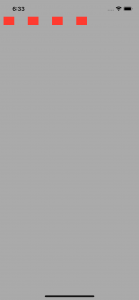
出来上がりのデザインは次のgif動画のようになります。
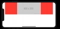
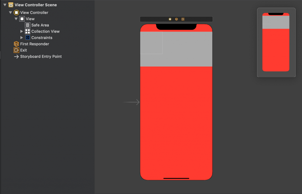
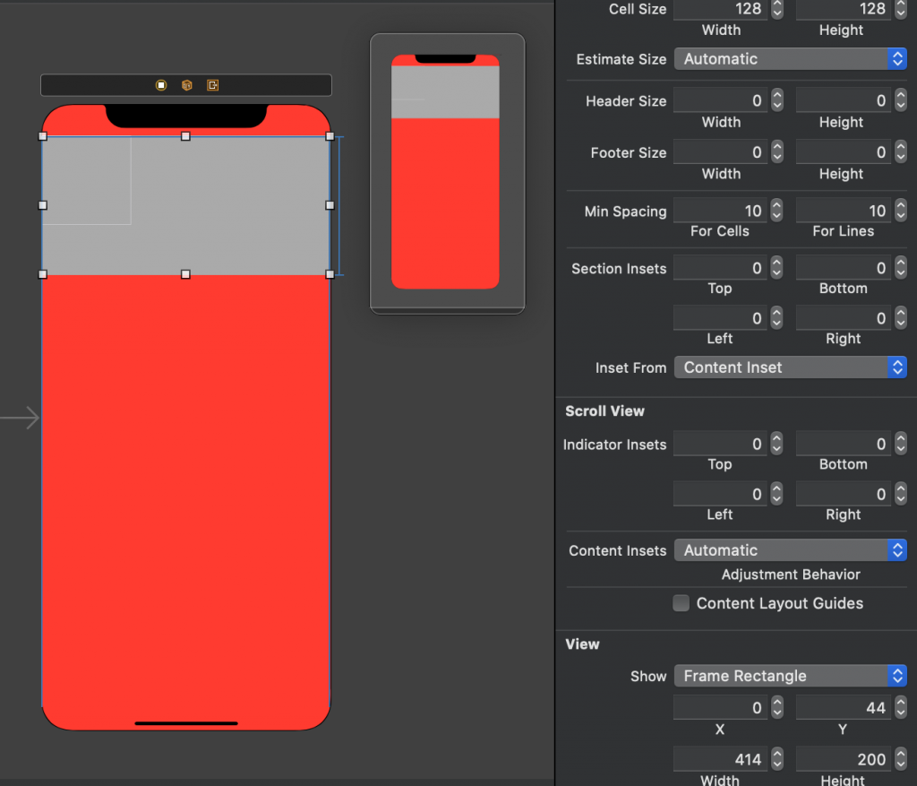
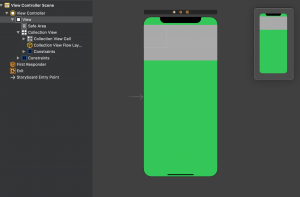
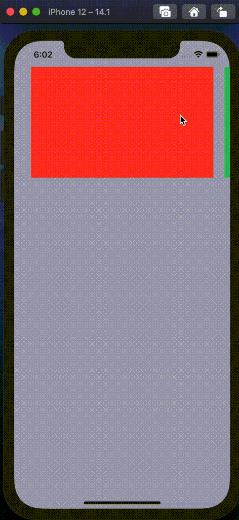
ViewControllerのstoryboardの設定になります。ViewControllerにはUIColletionViewだけ乗せるようします。
わかりやすいように背景色をRedにしました。
UICollectionViewのサイズの設定は次のようにしています。
今回はカスタムなセルを使いたいので、UICollectionViewCellのサブクラスを作成します。命名は何でも良いので、FirstCollectionViewCellとでも命名します。
FirstCollectionViewCell.swift
import UIKit

class FirstCollectionViewCell: UICollectionViewCell {

    static let identifier: String = "FirstCollectionViewCell"

    static let widthInset: CGFloat = 20.0
    static let cellWidth: CGFloat = 330
    static let cellHeight: CGFloat = 240

    override func awakeFromNib() {
        super.awakeFromNib()
        // Initialization code
    }
}
実際のデザインを作成させるときにセル間で隙間を作りたいので、staticなwidthInsetのプロパティを作っておきました。あとは個人のセンスの問題ですが、セルの幅と高さをサブクラスでもたせたほうが可読性が上がりそうなのでプロパティを設定しています。
カスタムなセルを実装する際、僕はxibファイルを使う派です。
FirstCollectionViewCell.xib
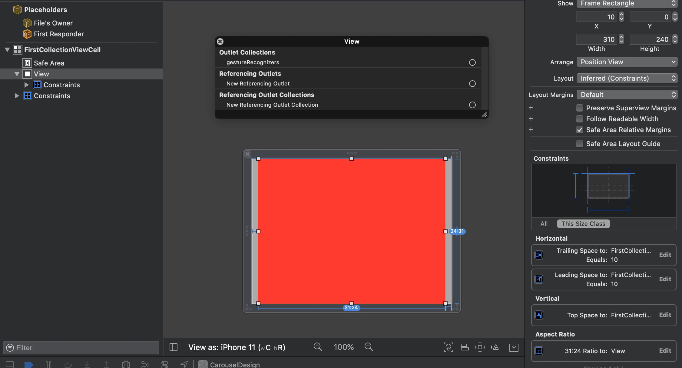
こんな感じでそれぞれ設定しています。
オートレイアウトの設定は
です。Aspect fit を付けておくことで高さのオートレイアウトを自動化しています。
あとは忘れがちなcellのidentifierをセットしておきます。今回は「FirstCollectionViewCell」とセットします。
これでカスタムクラスの実装が終わりになります。
それではViewController側の実装をしていきます。
ViewController.swift
import UIKit

class ViewController: UIViewController {

    @IBOutlet private weak var collectionView: UICollectionView! {
        didSet {
            let nibFiles = [
                FirstCollectionViewCell.identifier
            ]
            nibFiles.forEach { nibFile in
                collectionView.register(UINib(nibName: nibFile, bundle: nil), forCellWithReuseIdentifier: nibFile)
            }
        }
    }

    var array: [String]?

    override func viewDidLoad() {
        super.viewDidLoad()
        // Do any additional setup after loading the view.
        DispatchQueue.main.asyncAfter(deadline: .now() + 1.0) {
            self.array = ["a", "b", "c", "d"]
            self.collectionView.reloadData()
        }
    }

}

extension ViewController: UICollectionViewDataSource {
    func numberOfSections(in collectionView: UICollectionView) -> Int {
        return 1
    }

    func collectionView(_ collectionView: UICollectionView, numberOfItemsInSection section: Int) -> Int {
        return self.array?.count ?? 0
    }

    func collectionView(_ collectionView: UICollectionView, cellForItemAt indexPath: IndexPath) -> UICollectionViewCell {
        let cell = collectionView.dequeueReusableCell(withReuseIdentifier: FirstCollectionViewCell.identifier, for: indexPath)

        return cell
    }
}
これでMain.storyboardに戻ってIBOutletで宣言したUICollectionViewを接続します。
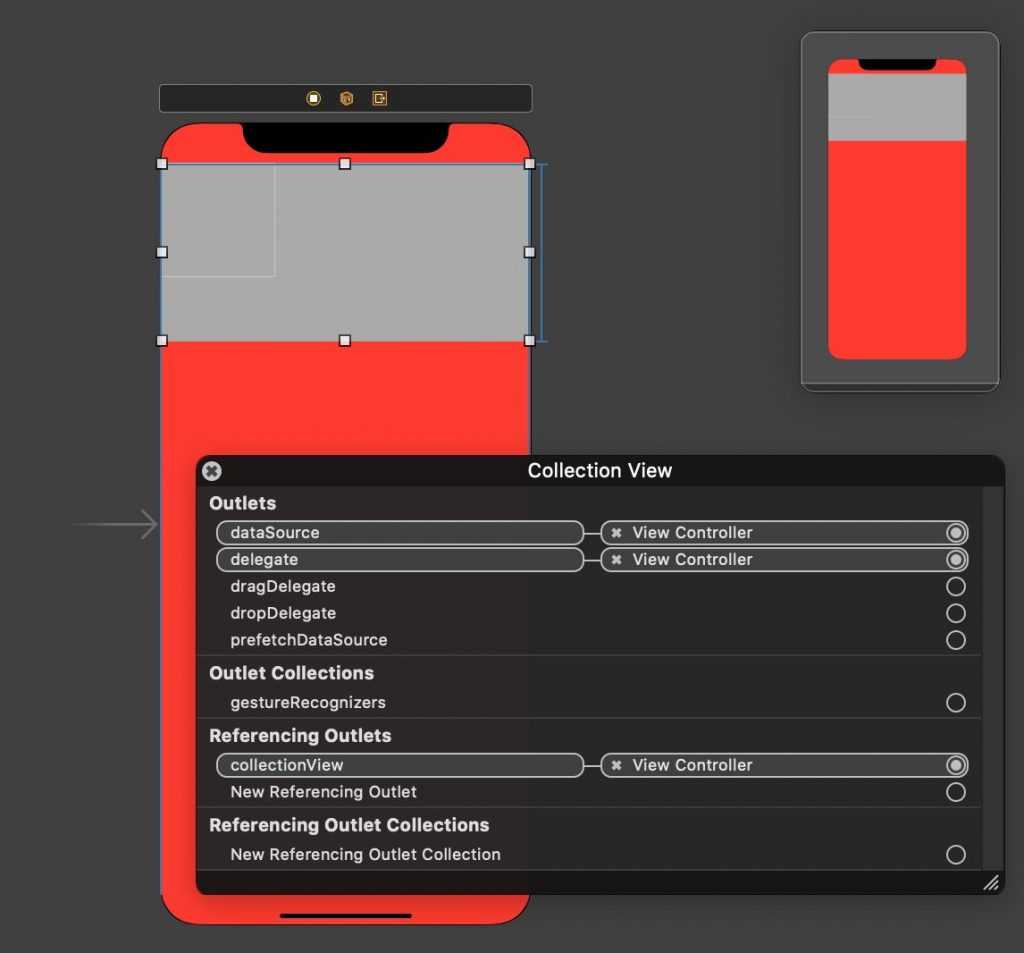
接続後、アプリをビルドしてUICollectionViewがちゃんと表示されたら準備が整います。
それでは本題のCarousel UIの実装を解説します。
Carousel UIのあの滑らかでページング横スクロールを再現するためにUICollectionViewFlowLayoutの機能を使う必要があります。
UICollectionViewFlowLayoutを継承したサブクラスを作成し、それをCarouselCollectionViewFlowLayoutと命名します。
CarouselCollectionViewFlowLayout
import UIKit

final class CarouselCollectionViewFlowLayout: UICollectionViewFlowLayout {
    override func targetContentOffset(forProposedContentOffset proposedContentOffset: CGPoint, withScrollingVelocity velocity: CGPoint) -> CGPoint {
        guard let collectionView = collectionView else { return .zero }
        let pageWidth = itemSize.width + minimumLineSpacing
        let currentPage = collectionView.contentOffset.x / pageWidth

        if abs(velocity.x) > 0.2 {
            let nextPage = (velocity.x > 0) ? ceil(currentPage) : floor(currentPage)
            return CGPoint(x: nextPage * pageWidth, y: proposedContentOffset.y)
        } else {
            return CGPoint(x: round(currentPage) * pageWidth, y: proposedContentOffset.y)
        }
    }
}
これでOKです。このクラスのこの実装であの滑らかな動きが再現します。ちなみにこの方法論は参考文献を確認したらすぐに分かります。
このCarouselCollectionViewFlowLayoutクラスをUICollectionViewのcollectionViewLayoutプロパティにセットします。
ViewControllerクラスに戻ります。
viewDidLoad()関数を次のように変更します。
ViewController.swift
override func viewDidLoad() {
super.viewDidLoad()
// Do any additional setup after loading the view.
DispatchQueue.main.asyncAfter(deadline: .now() + 1.0) {
self.array = ["a", "b", "c", "d"]
self.collectionView.reloadData()
self.updateLayout()
}
}
private func updateLayout() {
let layout = CarouselCollectionViewFlowLayout()
let collectionViewSize = collectionView.frame.size
let cellInsets = UIEdgeInsets(top: 0.0, left: FirstCollectionViewCell.widthInset, bottom: 0.0, right: FirstCollectionViewCell.widthInset)
layout.scrollDirection = .horizontal
layout.minimumInteritemSpacing = 0
layout.minimumLineSpacing = 0
layout.sectionInset = cellInsets
let layoutWidth = collectionViewSize.width - FirstCollectionViewCell.widthInset * 2
let layoutHeight = layoutWidth * FirstCollectionViewCell.cellHeight / FirstCollectionViewCell.cellWidth
layout.itemSize = CGSize(width: layoutWidth, height: layoutHeight)
collectionView.collectionViewLayout = layout
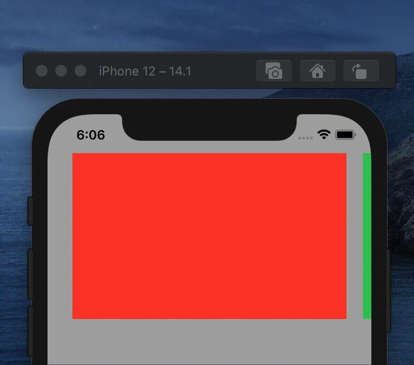
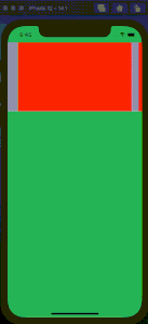
}Main.storyboardの背景色を緑色にします。
これでアプリをビルドするとカルーセルデザインが出来上がっています。
実はここまでの内容でカルーセルUIが実現できて終わったねといえたのですが、ここからが本番でした。これは一つのSectionしか使わなくて良いのですが、要望がいろんなデザインをここに表示させたいということでした。
つまり、複数セクションに対応しなければいけない場合をここから解説していきます。
ということで、複数のカスタムセルを一つのUICollectionViewに表示させる方法を解説していきます。結論からいうとジェネリクスを使います。
UICollectionViewの拡張クラスを実装します。名前は何でも良いのですが、UICollectionView+ReusableCellと命名します。
UICollectionView+ReusableCell.swift
import Foundation
import UIKit

extension UICollectionView {
    func genericDequeueReusableCell<T>(withIdentifier identifier: String, for indexPath: IndexPath) -> T {
        return dequeueReusableCell(withReuseIdentifier: identifier, for: indexPath) as! T
    }

    func genericDequeueReusableCell<T>(for indexPath: IndexPath) -> T {
        return genericDequeueReusableCell(withIdentifier: String(describing: T.self), for: indexPath)
    }
}
これでセルの再利用の際にUICollectionViewCellを継承したサブクラスを呼び出すことができるようになります。
ViewControllerクラスに戻ります。
好みの問題ですが、僕はUITableViewやUICollectionViewで複数のカスタムセルを使う場合はenumで管理していますのでSectionのenumを宣言しておきます。
ViewController.swift
enum CarouselCell: Int {
    case first
    case second
    case third
    case fourth
}
UICollectionViewのUICollectionViewDataSource部分を変更します。
ViewController.swift
extension ViewController: UICollectionViewDataSource {
func numberOfSections(in collectionView: UICollectionView) -> Int {
return 1
}
func collectionView(_ collectionView: UICollectionView, numberOfItemsInSection section: Int) -> Int {
return self.array?.count ?? 0
}
func collectionView(_ collectionView: UICollectionView, cellForItemAt indexPath: IndexPath) -> UICollectionViewCell {
// let cell = collectionView.dequeueReusableCell(withReuseIdentifier: FirstCollectionViewCell.identifier, for: indexPath)
// return cell
switch indexPath.row {
case CarouselCell.first.rawValue:
let cell: FirstCollectionViewCell = collectionView.genericDequeueReusableCell(for: indexPath)
return cell
case CarouselCell.second.rawValue:
let cell: SecondCollectionViewCell = collectionView.genericDequeueReusableCell(for: indexPath)
return cell
case CarouselCell.third.rawValue:
let cell: ThirdCollectionViewCell = collectionView.genericDequeueReusableCell(for: indexPath)
return cell
case CarouselCell.fourth.rawValue:
let cell: FourthCollectionViewCell = collectionView.genericDequeueReusableCell(for: indexPath)
return cell
default:
let cell: FirstCollectionViewCell = collectionView.genericDequeueReusableCell(for: indexPath)
return cell
}
}
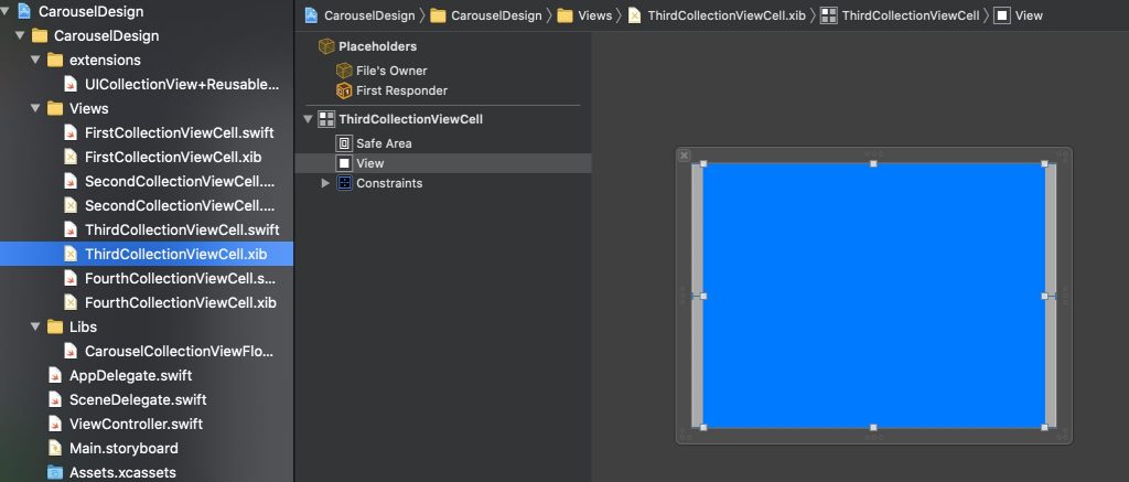
}SecondCollectionViewCell, ThirdCollectionViewCell, FourthCollectionViewCellはFirstCollectionViewCellと同じように作っています。背景色だけ変えています。
あと忘れがちなのが、Cellのidentifierの設定とregister登録ですね。
ViewControllerクラスの
@IBOutlet private weak var collectionView: UICollectionView!の部分を次のように変更します。
@IBOutlet private weak var collectionView: UICollectionView! {
didSet {
let nibFiles = [
FirstCollectionViewCell.identifier,
SecondCollectionViewCell.identifier,
ThirdCollectionViewCell.identifier,
FourthCollectionViewCell.identifier,
]
nibFiles.forEach { nibFile in
collectionView.register(UINib(nibName: nibFile, bundle: nil), forCellWithReuseIdentifier: nibFile)
}
}
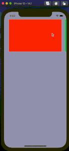
}これで完成になります。アプリをビルドするとカルーセルデザインが出来上がっているはずです。
|  |
ということでこれで晴れて複数セクションに対するカルーセルUIが完成しました。